• Maps
  • Remastering UT4 Style

I am aware that the old UT99 style is dark and a lot of castle like textures. But personally I am fan of light simple futuristic textures, it's also the reason I am trying this out.

I mean the year is 2291 in UTWorld πŸ˜› so we may assume that things are a bit more modern πŸ˜ƒ


    im also fan of the lighter maps , good job.

    Awesome. This map is too dark in original ^^

    Looks good looking forward to trying it out.

    If you are interested to follow the progress step by step, i'll post some updates here


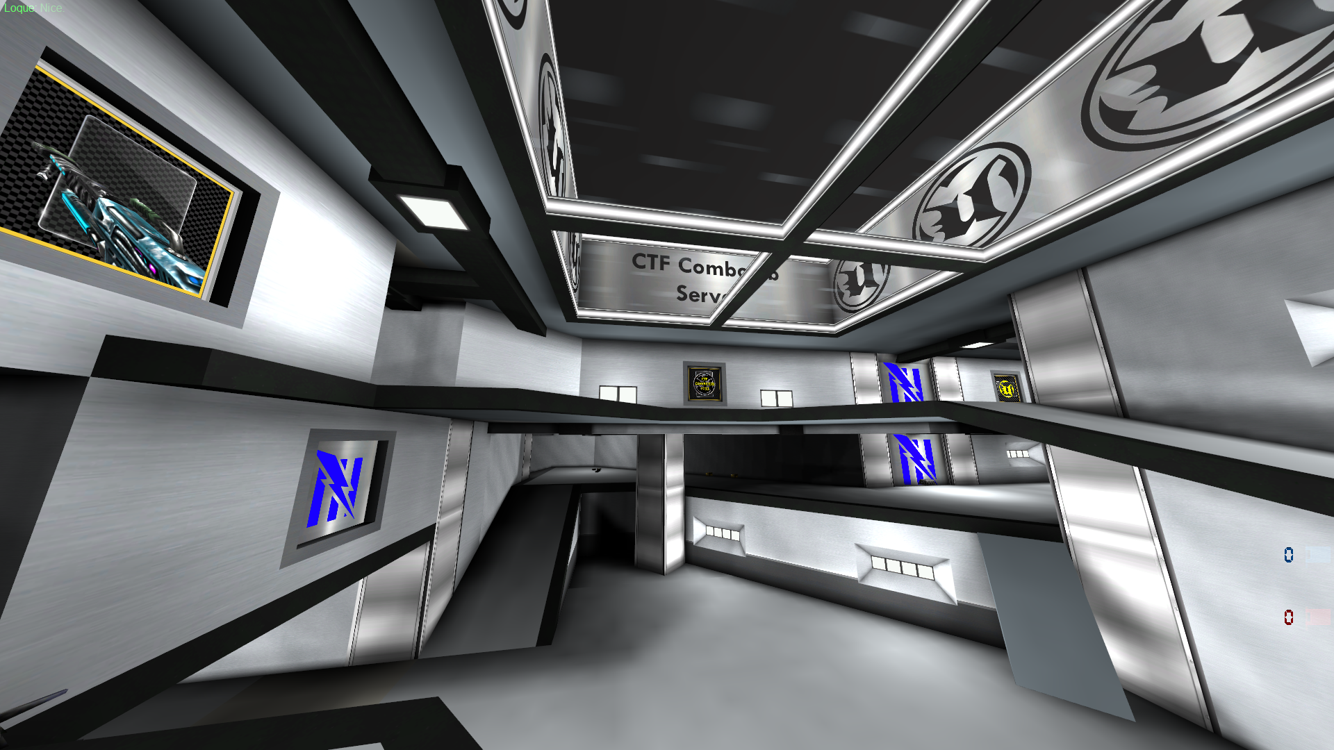
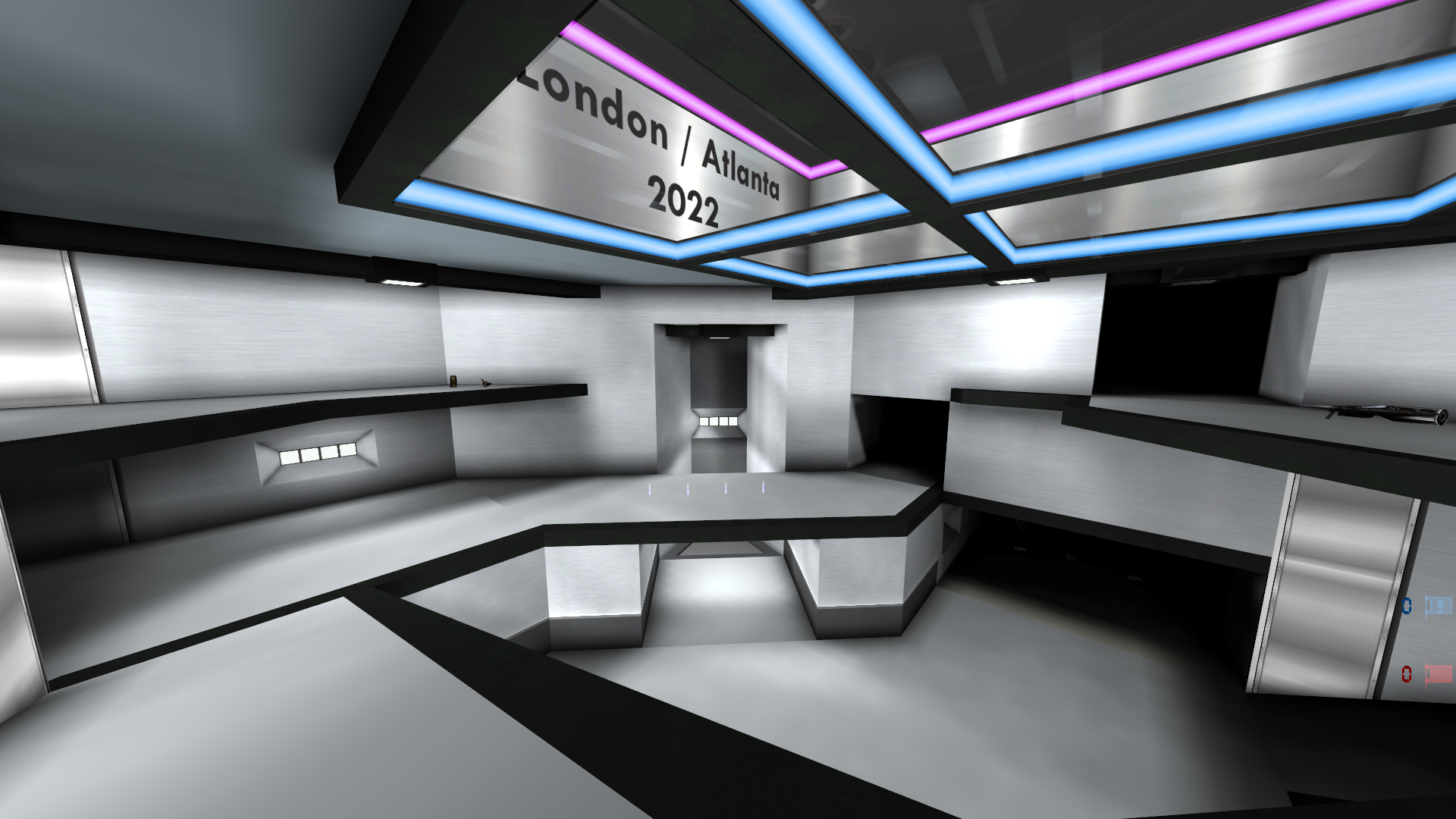
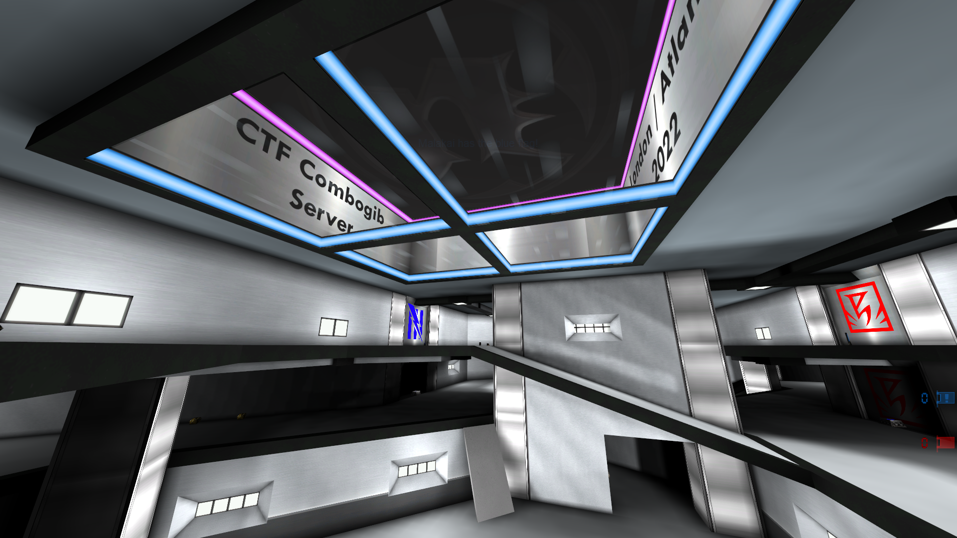
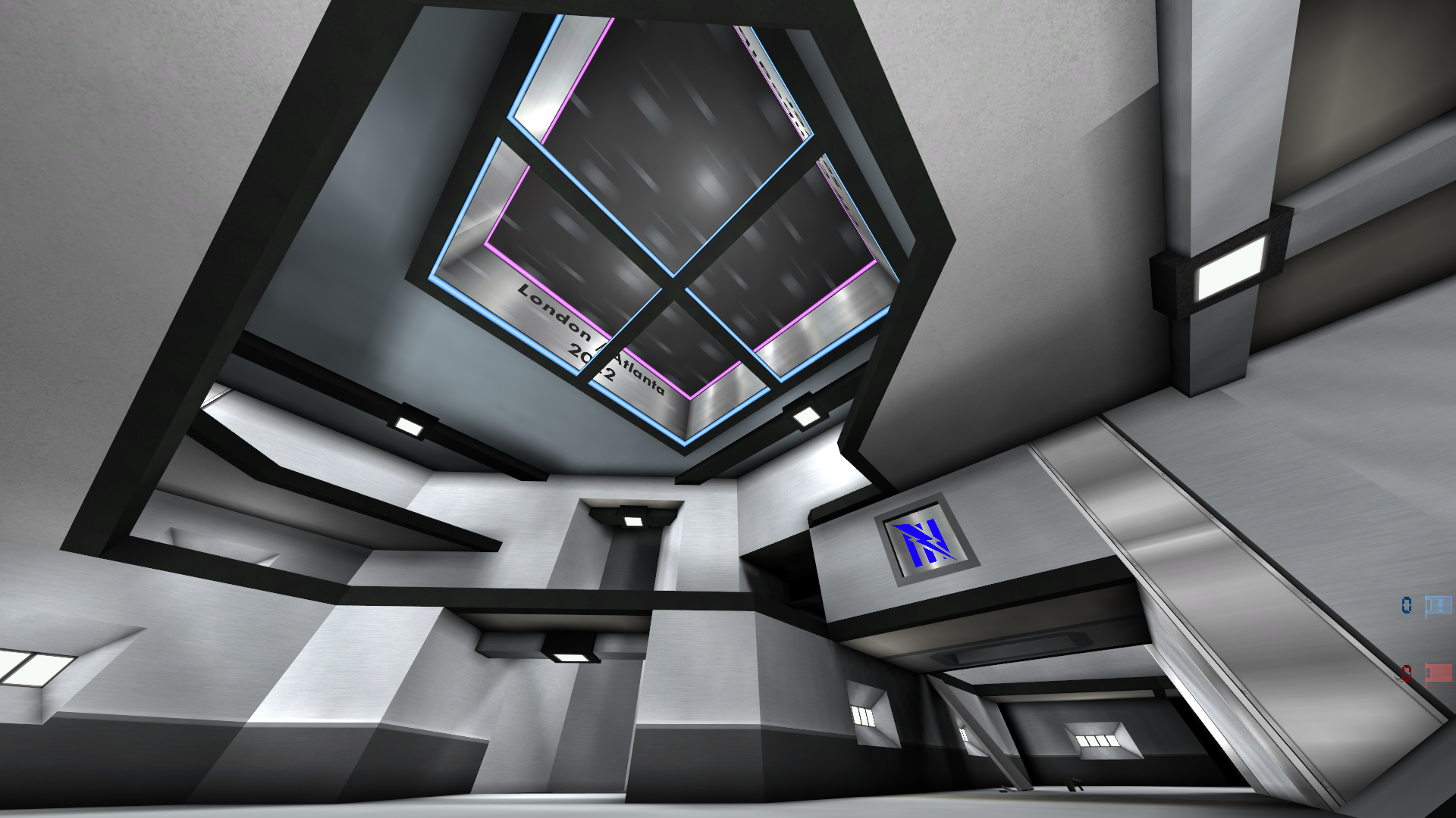
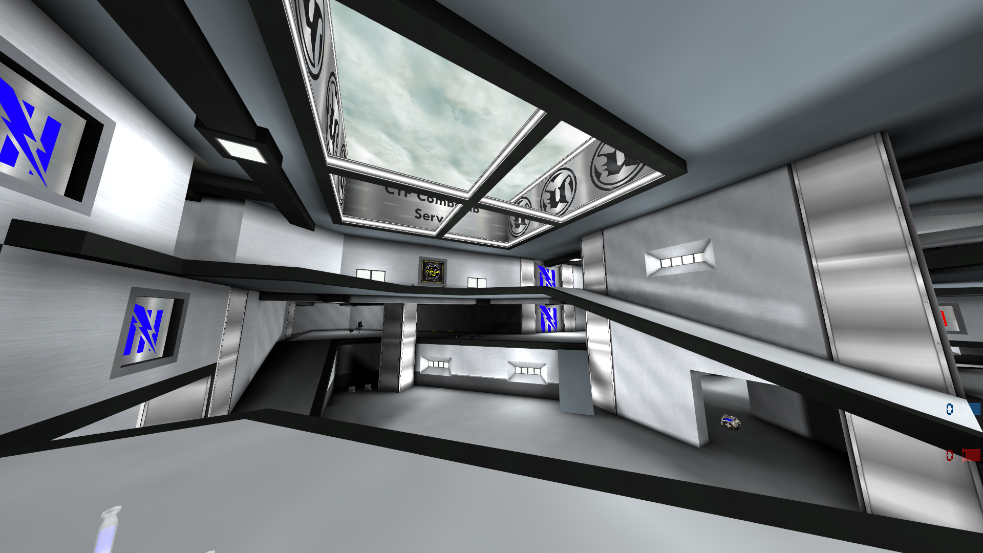
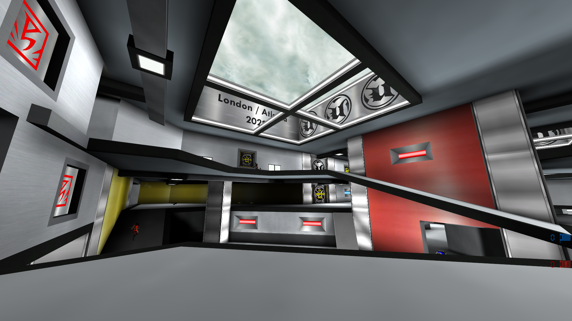
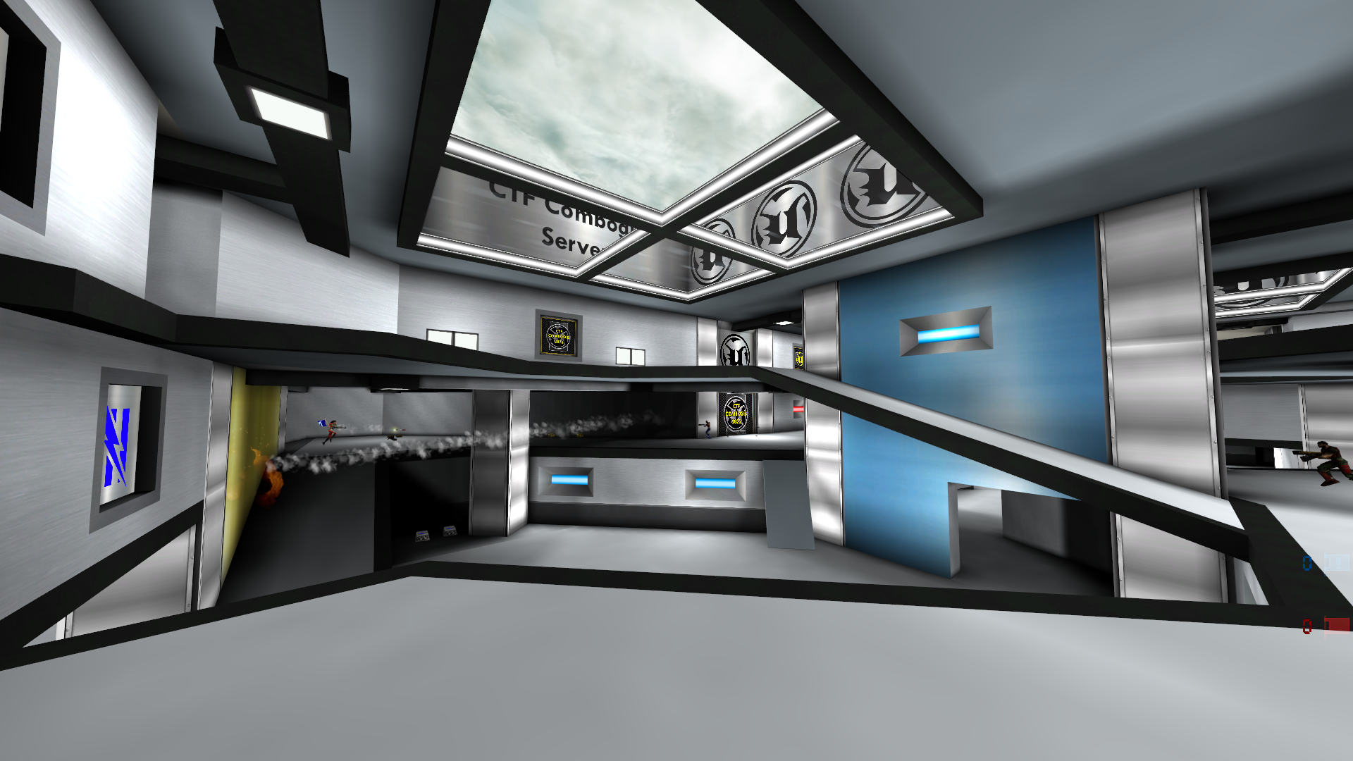
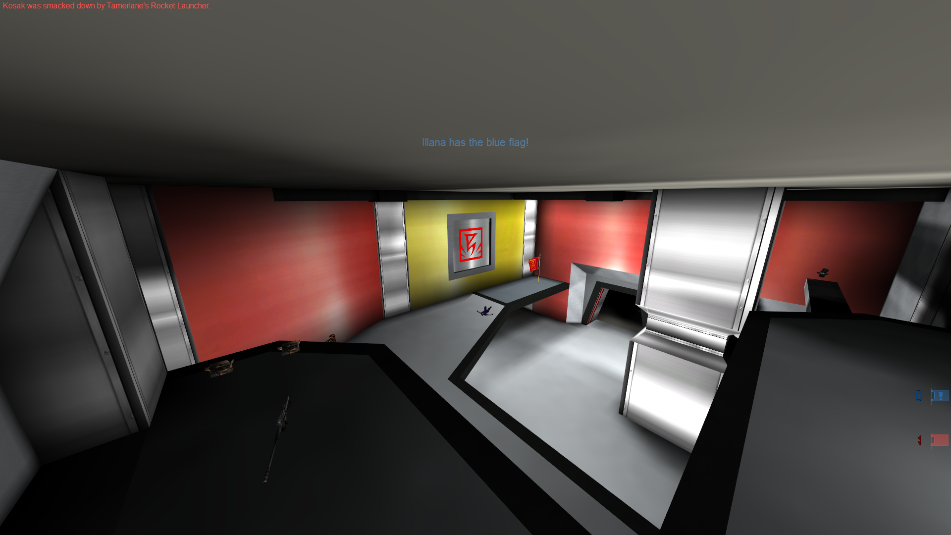
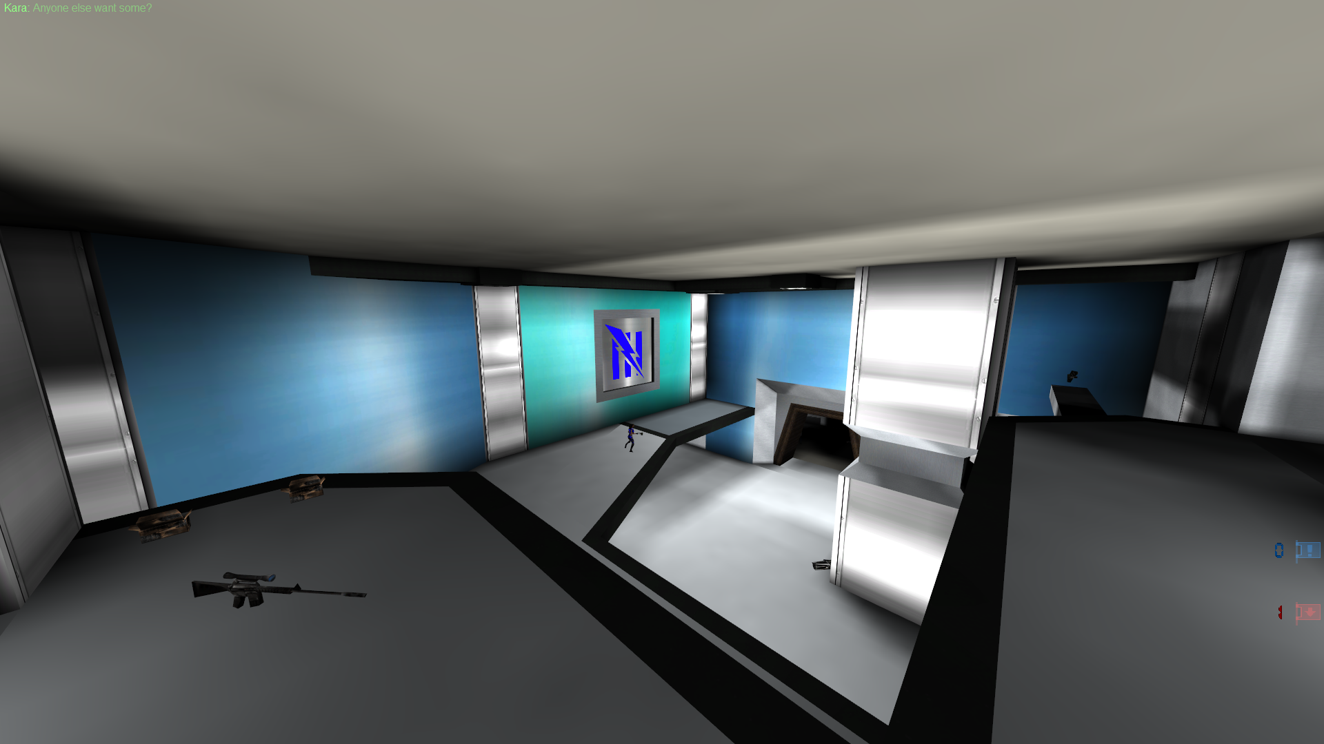
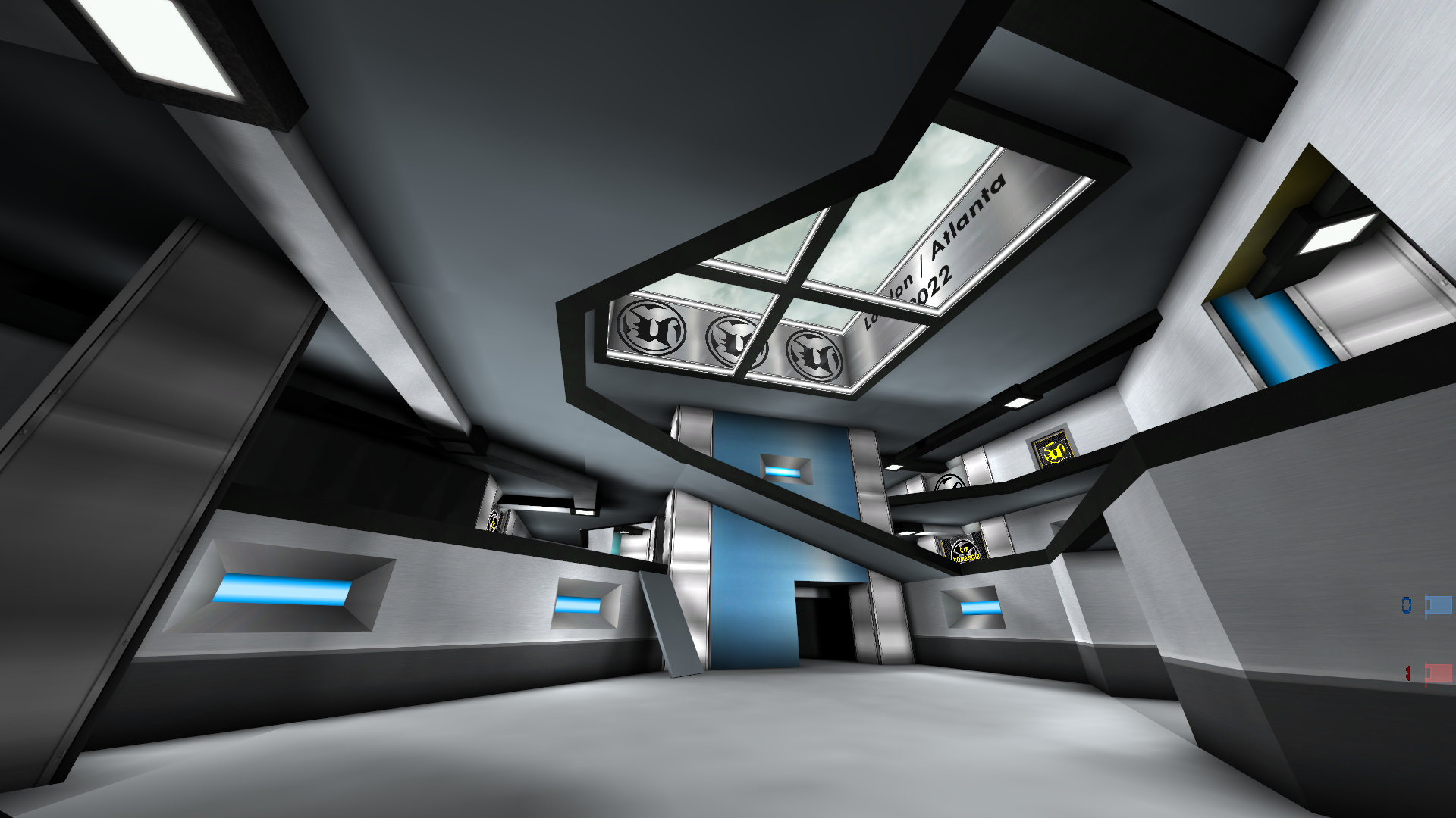
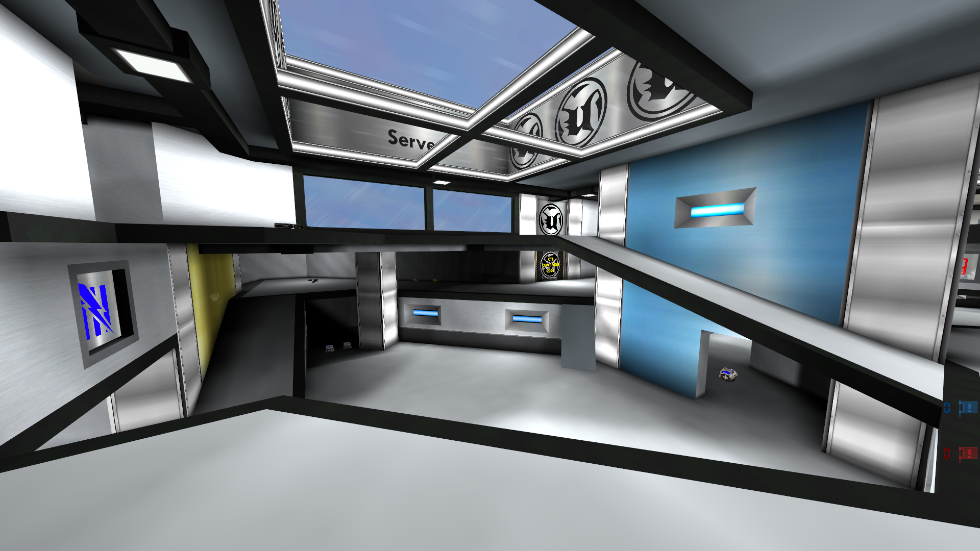
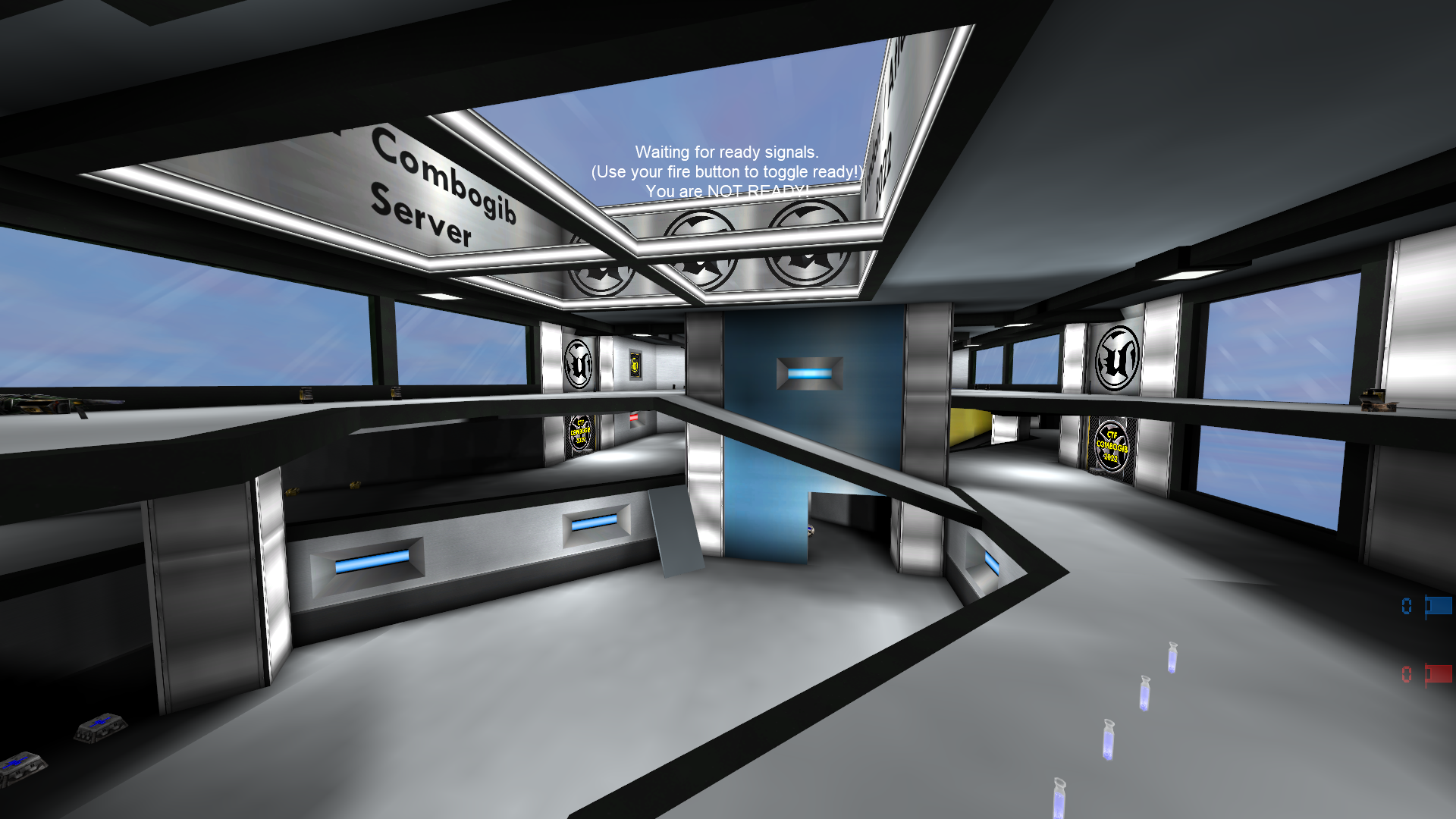
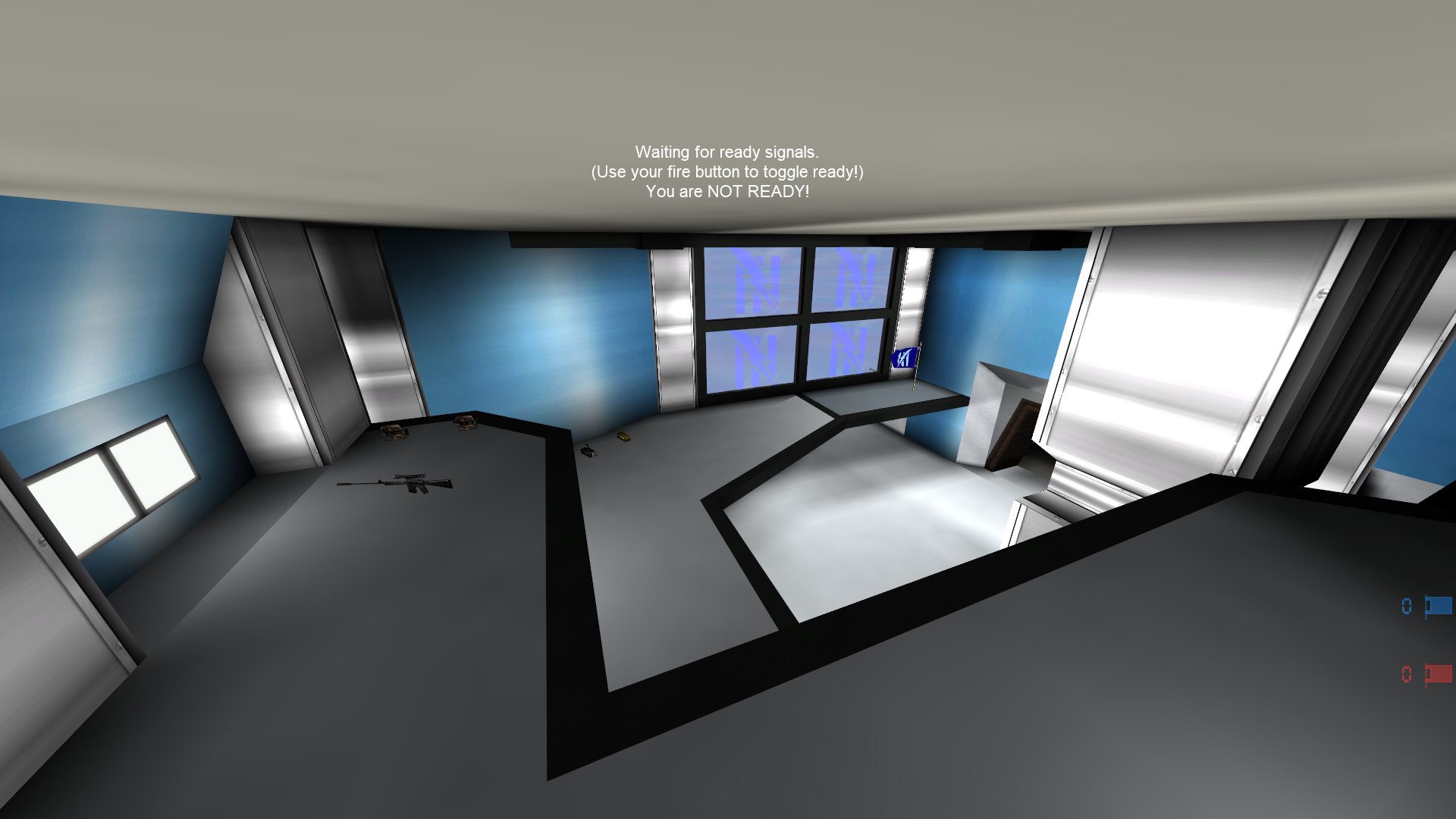
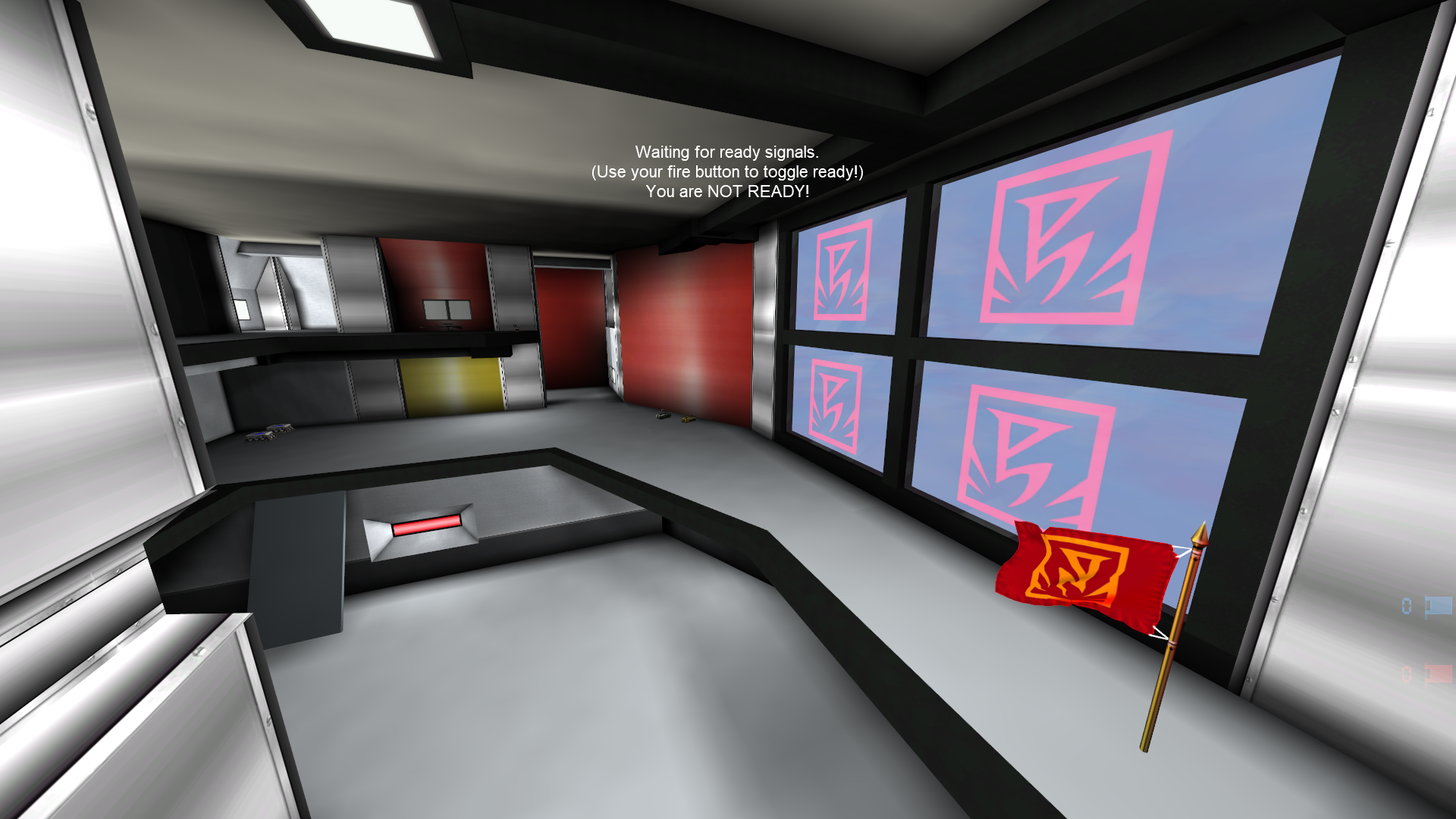
    Just sending random updates, as you can see, when mapping, often you work on the same things, new textures, new styles, new angles. Often you spend a lot of time doing the same thing over again, but differently. But in the end, the result of that pays off imho.

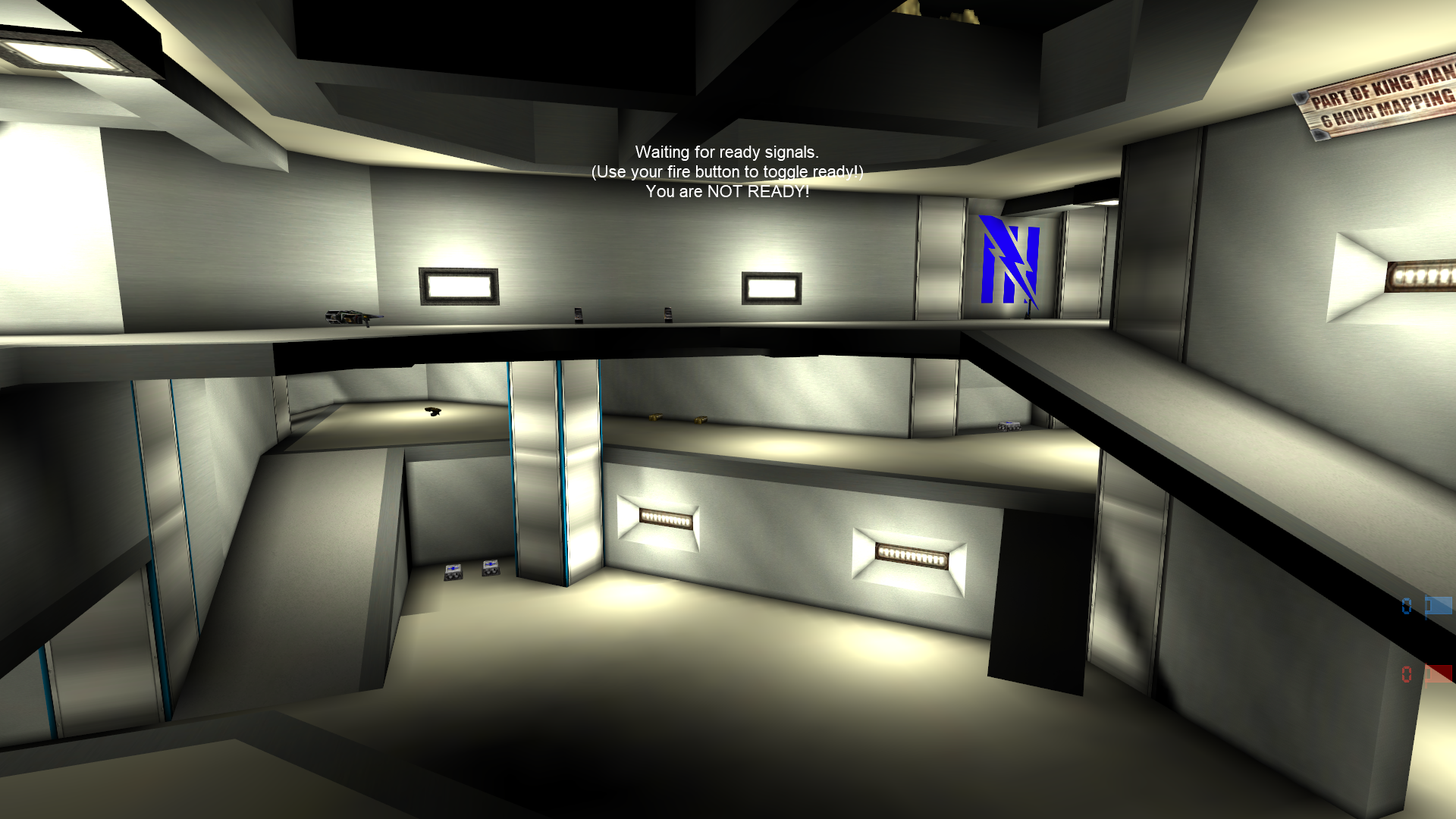
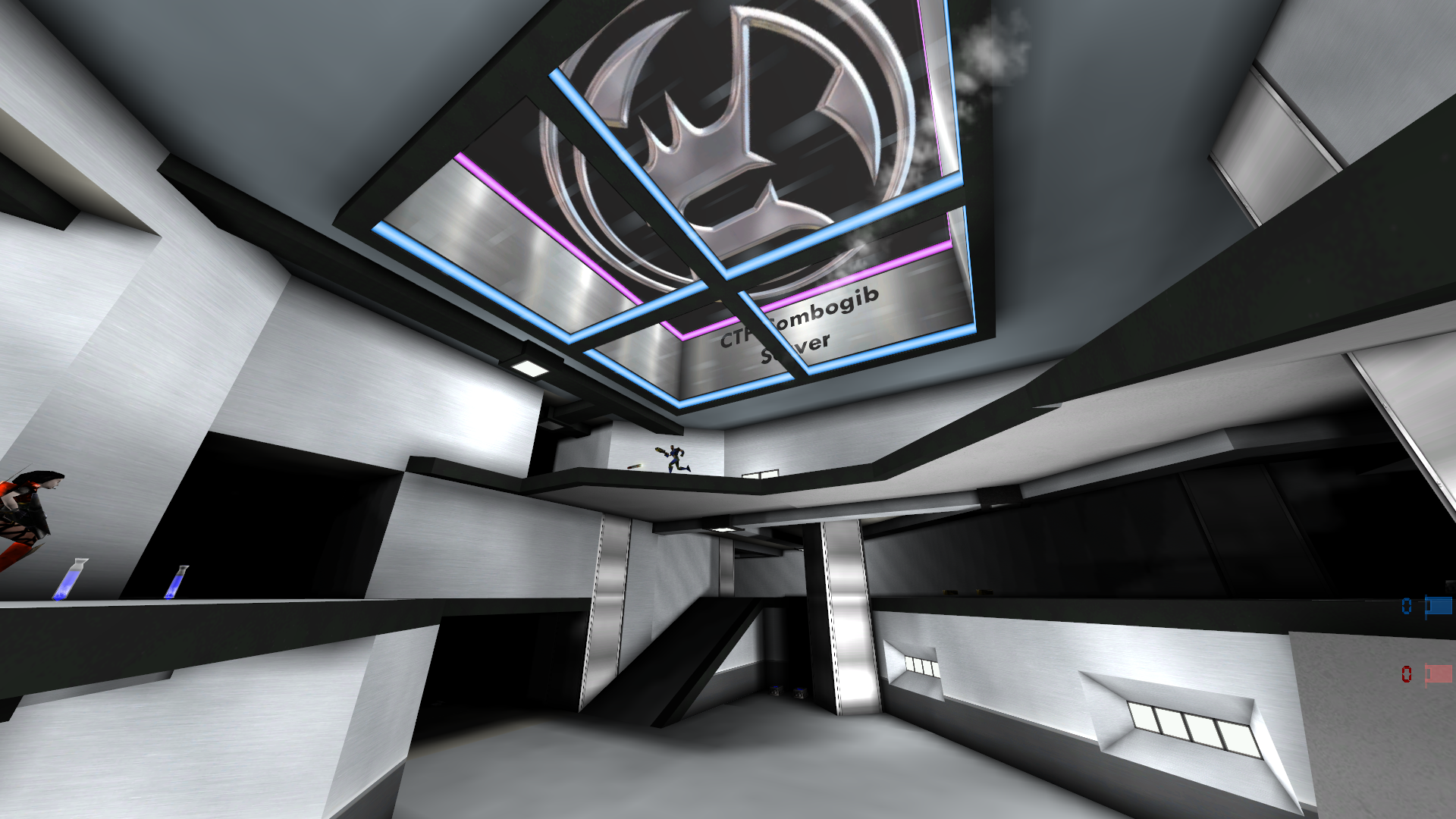
    The main object now, is to add colors to a predominantly grey looking map. Not by adjusting textures, but by adding details such as pictures in color. That often gives the result that a grey looking map can indeed be colourful if these addons blend in well.

    Like, should it be dark outside, like above?

    Or should it be light like below πŸ˜›, so many options.

    its looking super nice! but i bet my crossair is going to struggle xP

    is it possible to have that ig+ crossair in the newnet stuff?

    Kinda reminds of grendel tech map . Reskin of grendel would be 😎

    Guess the building has to be a little bit more open πŸ˜‰ Just need a good skybox for a good view. That's hard to make i figured πŸ™‚

    • [deleted]

    I find some of the "new" texture less maps very bland and the crosshair kinda disappears.

    Some of the old maps might be a bit dark but these screenshot's make this map look very sterile, its like being inside an aluminium pot. It really needs something to break that insipid and sterile look IMO.

    • jerc replied to this.
      • [deleted]

      jerc

      its' not the lack of detail (I play with textures on minimum). ItΒ«s the choice of textures that are too bland for me. Give it just some colour and reduce the dreadfull grey and these new map versions will look much much better.

      Write a Reply...